The Color dialog lets you pick and manage colors. There are several different modes you can use to select colors. It also offers a color picker to select a color anywhere on your screen.
This dialog works on either the foreground or the background color.
Der Dialog „Ablagen“ ist dockbar. Informationen hierzu finden Sie im Abschnitt Abschnitt 2.3, „Docks und Dialoge“.
Er kann auf verschiedene Arten aufgerufen werden:
-
From the main menu: → → .
-
From the Tab menu in any dockable dialog by clicking the tab menu button
 and selecting
→ .
and selecting
→ .
-
From the toolbox: click on the current Foreground or Background color.
In the menu, there is a list of detached windows which exists only if at least one dialog remains open. In this case, you can raise the „FG/BG“ dialog from the main menu: → .
The dialog offers a number of different color selector modes at the top:
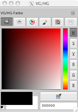
- GIMP
-
Im Farbwähler „GIMP“ (symbolisiert durch einen kleinen Wilber) finden Sie zum Einstellen der Farbe einen großen rechteckigen Bereich mit einem Fadenkreuz, rechts daneben ein Farbband sowie wiederum rechts vom Farbband eine Reihe von Knöpfen. Die Knöpfe H, S, V, R, G sowie B ermöglichen Ihnen die Auswahl der Komponente, die Sie im Farbstreifen einstellen können. Dabei stehen H, S und V für die Komponenten des HSV -Farbmodells und R, G und B für die des RGB -Farbmodells. Der rechteckige Bereich mit Fadenkreuz bildet dann die jeweils verbleibenden zwei Komponenten des Modells ab.
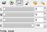
- CMYK
-
You get to this selector by clicking on the CMYK icon. The CMYK view gives you the possibility to manage colors from the CMYK color model.
Below the CMYK color sliders, the Total Ink Coverage and the name of the CMYK color profile will be shown.
If a CMYK profile is attached to the image, the profile will be used to determine the CMYK colors. See Soft-Proof Profile for more information. Otherwise, a „naive“ color conversion will be performed.
The Total Ink Coverage of the selected color can be used when printing, as depending on the paper type there may be a limit on how much ink can be applied.
- Wasserfarbe
-
This selector is a little different than the other models. The principle consists in changing the current foreground color by clicking in the rectangular palette. If the current foreground color is for example white, then it turns reddish by clicking in the red color area. Repeated clicking strengthens the effect. With the slider, which is next to the color palette, you can set the color quantity per mouse click. The higher the sliding control is, the more color is taken up per click.
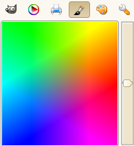
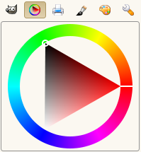
- Wheel
-
This selector uses the HSV color model. Click in the chromatic circle and drag the mouse pointer to select the Hue. Click-and-drag in the triangle to vary the Saturation (vertically) and Value (horizontally).
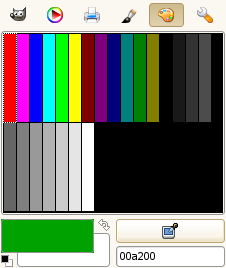
- Farbpalette
-
This color selector brings up a list of the colors from the current palette in the Palettes dialog. You can set GIMP's foreground or background colors by clicking on colors in the colors display. You can also use the arrow keys to move within the list of colors.
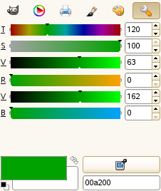
- Schieberegler
-
This selector displays a global view of the R, G, B channels and either the H, S, V or L, c, h values, placed in sliders. The numbers can be represented as 0 to 255 or 0.0 to 100.0 ranges.
Magenta areas on the sliders indicate colors that are out of gamut. This means that the value on the slider would mathematically define a color that does not exist in your chosen color profile. For more information, see Gamut. If you move a slider to a value that is out of gamut, the color remains set to the last in-gamut color that you selected.
![[Anmerkung]](images/note.png)
Anmerkung You can set which color is used to mark out of gamut colors in the Soft-Proofing Preferences.
At the bottom, further options and tools are available:
- Foreground and background color
-
The symbol consisting of two arrows allows you to exchange the foreground and background color. At the bottom left of this icon, below the foreground color block, you find a switching surface with two small, one black and the other white, partially overlapping squares. If you click on these, the front and background color are reset to black and white respectively.
- Pipette
-
The Color Dialog color picker has a completely different behavior than the color picker tool. Instead of picking the colors from the active image, you're able to pick colors from the entire screen.
The downside is that you get colors after they got processed by the full system color stack, in particular color management. It means that the resulting color values may end up different from ones returned by the color picker tool when picking over the canvas. It is up to you to make an informed choice of which color picker to use.
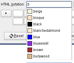
- HTML-Notation
-
This is a text field with six characters. See HTML notation. You can also use the CSS keywords; enter the first letter of a color to get a list of colors with their keyword:
Right-clicking in the HTML Notation text box opens a context menu that allows you to edit your notation, particularly to paste a complex notation you have copied elsewhere.
- Last used colors
-
Twelve buttons at the bottom show the last used colors. You may choose a color by clicking on one of these buttons or add the current foreground or background color to this history list.